Thanks to the report of NASA representatives on the visit to Elon Musk's company, photos of Starship controls appeared for the first time.
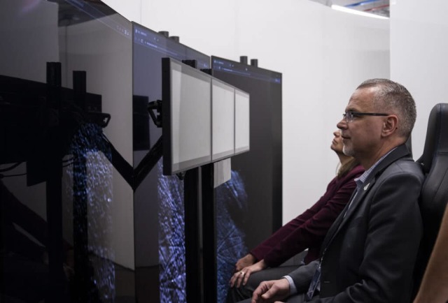
In early May, representatives of the US National Aeronautics and Space Administration (NASA) conducted a kind of inspection of contractors working for the Artemis program. Photos from the visit to SpaceX were shared on social networks by Jim Free and Catherine Koerner, two high—ranking heads of the directorate for the development of tools for NASA's manned space Exploration (Exploration Systems Development).
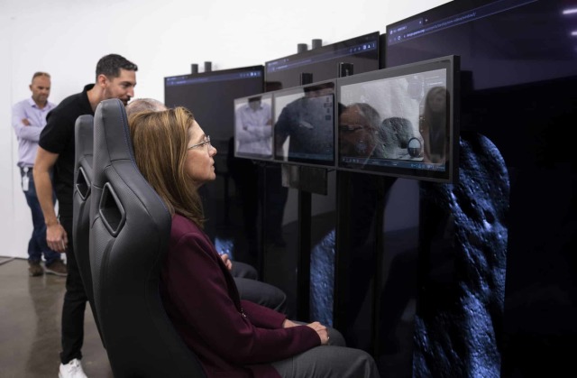
While visiting, perhaps, the most important contractor for directly landing on the Moon, Jim and Catherine personally got acquainted with the prototype of the Starship HLS (Human Landing System) cabin. All the pictures taken during this visit, which NASA officials posted on the Internet, were put together by users of the Reddit portal. They also corrected the images so that some details could be seen better.
Those who have seen astronauts working in another SpaceX spacecraft — Crew Dragon— will find this prototype very familiar. Similarly, the crew seats are located in front of three touch-screen monitors. Only in this case, three more huge portrait-oriented panels have been added, which display a view of the lunar surface from a height. This is probably an imitation of the Starship HLS portholes. Or maybe it's just an element of additional immersion in the atmosphere of upcoming missions for those who are testing a prototype. And there are two seats, not three — in the first landings on the Moon, only a couple of astronauts will descend.

An enlarged fragment of the photo of the Starship HLS interface is an indicator of engine operation. Six Raptors are visible (three vacuum ones with a large nozzle and three atmospheric ones with a small one). Four more engines are visible in the pylons, their name, functionality and power are unknownImage Source: TJ Cooney
The interface on the screens is similar, but not identical to that of Crew Dragon — the changes made specifically for Starship HLS are already visible in it. From what you can see, the engine operation indicator located in the upper right corner of the rightmost display attracts attention. It shows six circles corresponding to Raptor main engines — three large diameter, three small.
This means that during the interface design, the configuration of the ship was chosen simultaneously with both vacuum-adapted nozzles and those that are optimal for working in the atmosphere. Why so is an open question, as far as we know, Starship HL S will not return to Earth in any of the existing versions of the Artemis program missions. Which means he doesn't need atmospheric Raptors either. Perhaps — they just used the old design of the "ordinary" Starship, or maybe it's another change in the concept, which has not yet been reported.
The most interesting thing is that the same indicator shows four engines much smaller than the Raptor. Previously, they were not on any scheme, as well as in general four pylons in the lower part of the ship. Most likely, this is an artifact inherited from Crew Dragon, where this interface block has this form. However, Crew Dragon has two circles in each pylon-indicators of SuperDraco engines, and on the prototype Starship HLS there is one unknown.

The image on the vertical monitors behind the main ones is displayed in a web browser. For SpaceX, this is a familiar solution, even the interface on the touch control displays is implemented in the same wayImage Source: Jim Free
Strangely, there are no additional soft landing engines located on the hull closer to the bow on the indicator. They were planned to be used in the final section of the descent, so as not to raise a lot of dust from the surface. There are no orientation engines either.
Among other interface details as curious and informative as the engine operation indicator is not visible. The indicators of the orientation of the ship in space, the landing site, the speed and altitude of the flight above the surface are distinguishable. There is a graph on the left side of the screen, but it is impossible to make out what is displayed on it.
Of course, the first look at the user interface of the lunar Starship is interesting. Especially considering that it will almost certainly be unified for all manned modifications of the ship. And it is already possible to judge some technical solutions, albeit only in general terms. But it is important to remember — this is only an early stage of development, Elon Musk's company is famous for abrupt course changes in the midst of working on a project.

